Planning a cabinetry layout for a kitchen, laundry room or other storage area can be a tricky thing. You need to consider so many variables: function, form, style, accessibility, usage. The process can be overwhelming. Since I've been thinking about this basement renovation, I dunno, for the last three years, I already mostly knew how I wanted my cabinets to look. But going through the planning with the help of a kitchen designer at
The Home Depot helped open my eyes to some planning options I never considered.
After we walked through the store and
picked out the cabinet colours and countertop finishes, we sat down to select the cabinet sizes and plan the layout. Here's the plan I've had in my head for all these years:
The cabinetry would go in the L-shaped area at the bottom of this image. Storage, storage, and more storage! The layout had to meet a few requirements:
- enough storage for craft & sewing supplies
- a small portion of the desk dedicated to a home office area
- a long banquette. I thought this would be great for Chloe to sit on when we're crafting at the harvest table. It would be a fun place too just to lie around and read a book.
Let's start with the home office area. Here's why I picked what I did, and some kitchen planning tips I learned up along the way:
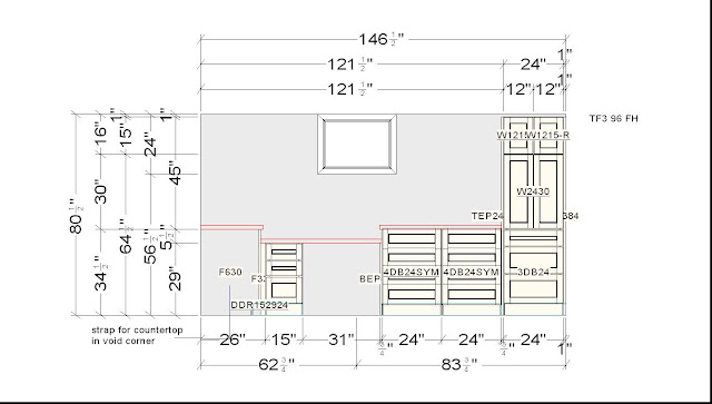
- Since we'll be sitting at a desk height chair, we needed to have the office zone at a lower height than the rest of the cabinetry, which is standard cabinet height (34"). We dropped down the countertop and "anchored" it with a pedestal that can be used to store hanging files.
- To the right of the office zone, there are two stacks of narrow drawers. These drawers are a perfect height for storing smaller craft supplies - pots of glitter, paintbrushes, glue gun, paper etc - and don't waste any space. Leave it to Martha Stewart to offer these cabinets suited to crafts :) I have two similar sized cabinets in the kitchen and use them for storing placemats and napkins, and for storing foil, wax paper, and ziploc bags. They are a great size for thinner objects and small canisters.
- I knew I wanted two tall towers at the ends of the L. This would help define the area as well as maximize storage.
- I love the deep pot drawers I have in the upstairs kitchen so I knew I wanted mostly pot drawers here in the basement as well. They are so much easier for pulling things in and out of.
- Atop the pot drawers, we stacked cabinets to the ceiling. I also incorporated one of my "must have" features: glass-front doors. When you have this much cabinetry, I think its important to keep things from looking too heavy. You can do that by mixing closed and open storage, or using glass or mesh front doors. In the craft area, glass-front doors have the bonus of revealing all the pretty things I'll have stored behind the doors like colourful bolts of fabric or pretty wrapping paper.

Looking good so far. Onto the craft zone cabinetry:
- This was a long wall, so we knew we needed some variation in height to make it look more interesting and not so long and boring. Again, one end is defined by a tall cabinet. As I mentioned before, we have a wide bulkhead over this end. Since we started planning the cabinetry before the bulkhead was fully framed in, we built the bulkhead to be exactly the same width as the cabinet below. This way, there would be no weird ceiling jogs. A small detail, but one which will overall make this part of the room look cleaner and more intentional.
- I knew I didn't want the tall cabinets to drop down immediately to banquette height. I thought that would feel funny, like you're sitting beside a wall. So, we incorporated some smaller bookcases on either end of the banquette. A perfect place for Chloe to store some of her books, and its also easily accessible if she's lying on the bench reading.
- I thought we would have to DIY the banquette: use cabinet uppers, strap them together, and build a plywood top to hide the seams and give a place to put the bench cushion on to. Yet again, the ever smart Martha has already thought of that and offers bench cabinets (the drawers pull out, instead of having doors which open to the sides like cabinet uppers would have) as well as a matching board which can placed over the bench drawers to create a stable, strong bench.

You always want to allow for some variance in your cabinetry plan since ceilings and floors may not be exactly level. We have a bit of "play" with the 4 1/2" toekick that runs along the bottom of all the cabinetry, and in the filler panels near the corner where the countertops meet. Additionally, you want to wait until at least after framing is done to take measurements, then include additional room for the drywall and flooring still to come, and then plan and order your cabinets.
So that was the plan. Ready to see what this will all look like?
I think I will be in storage heaven. That's the plan anyway :)
Amber, the kitchen designer at The Home Depot was a great help and actually made this process fun and quick. It was helpful that she knew the cabinet sizes offered - it was easier for her to mix and match and offer options, than if I had to go through the catalogue and use an online tool and plan it all from scratch myself.
So if you're planning your own renovation and are considering meeting with a kitchen designer, here's some tips from The Home Depot on how to get the most out of your design:
- When working on layout take into account how you are going to use the space, where you would want items stored.
- Make a list of things you like about your current kitchen and things that you don't
- Mark any images (concepts you like, this helps get an idea of overall picture, ie dark cabinets, light cabinets, granite etc)
- Measure walls and opening locations (always measure from the outside of the casing around doors and windows, you don't want to have to cut into them), and measure out plumbing and electrical locations
- Make a list of everything that needs a place in your kitchen (or space you are designing) and ensure that you have accounted for all these items (Amber likes to label the elevations with what's being stored in each spot. Good to know that your cumbersome KitchenAid mixer has a home!)
- And a few helpful cost-cutting tips:
- Always upgrade on the construction (ie wood drawers and metal drawer guides vs nylon) and maybe go for a less detailed door or something with a standard finish (vs paying for a premium finish)
- If finishing ends is extra, only finish ends that are exposed
- Upgrade to a bank of drawers where you want drawers and down grade to a full height door everywhere else (rather than having a drawer at the top of every cabinet). This saves cost overall.
- Some cabinet companies offer the option to profile the drawer or have a slab front (slab fronts cost less)
This project was sponsored by The Home Depot. All the opinions expressed are my own.


